

Hello,
I recently bought a Z11 Pro Max to replace a six year old box from another brand and am still getting used to the change. Mostly it's a superb upgrade but there are a few niggles where I'm wondering if that's down to me not understanding everything with the new kit or something we have to accept. Any suggestions for solutions are welcome.
1. VOD Favourites
I've seen how you can create groups of favourite channels so, for example, each member of the family can have their own selection. This is really nice but we don't tend to watch much live tv. However, this would be absolutely perfect in the VOD favourites section. From what I can see that isn't possible or am I missing it somehow? Or is it a feature that might come? Our Favourites is already an unwieldy mix of choices from the kids, my wife and me and it's only going to get worse. Also, with the favourites I couldn't find a way to sort them. It seems most recently added first is the only way rather than, for example, most recently updated so you could see those series that have had an episode added. Same for that, am I missing it or is it something in the pipeline?
2. VOD Recently Added
In the 'Recently Added' section the layout is really bad. It's one long sideways scrolling list where scrolling right only adds one new programme at a time rather than a whole new batch. Plus the programme info is shown at the top but half the description is cut off so you have to click through to read each one. Feels like this is a step back on the layout with that six year other box which had a vertical list of text that scrolled a whole screen at a time and programme info to the side with everything showing. I get the idea of wanting the programme images there now rather than just text but by making it scroll so slowly and by cutting of the description it's making it harder to use. Is there a way to switch the layout? For example, in the favourites the programmes are in a vertical line and when you go down you get a whole new line of them which at least makes navigating quicker.
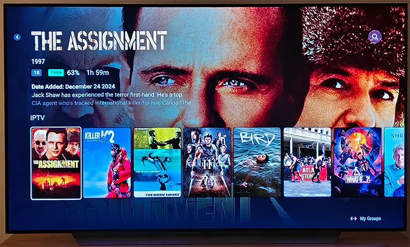
This is the current layout for Recently Added:
3. Channel Spacing
Is there a way to control the spacing between the channels? I get it might be more aesthetically pleasing to have space between them but reducing the amount of channels on screen makes scrolling more of a hassle.
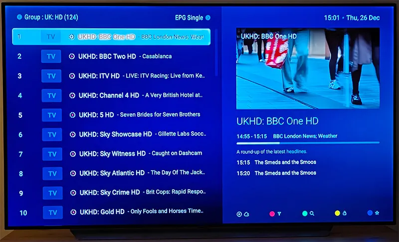
This is how it looks for me:
One other aside: I did go through the forum a bit and saw people mention using multiple sources. I'm probably missing it but why do you need more than one? I've been paying for my current iptv provider for about five years (replacing another that disappeared but who we'd used for about another five years prior to that) and it seems to have pretty much everything. Is there a reason to add a second or third one that I'm missing?
Thanks for any thoughts and suggestions on any of the above.