
Note : It’s my first post in the forum, so I hope you will be understanding if my thoughts don’t follow some rules that I’m not aware of yet.
I look forward to reading all your comments about my suggestion
I believe there are several improvements that could greatly enhance the overall user experience.
I have attached a screenshot of the Movies/Series library interface, and I would like to share my feedback with you.
I have divided the observations into three zones: A, B, and C, as shown in the image.
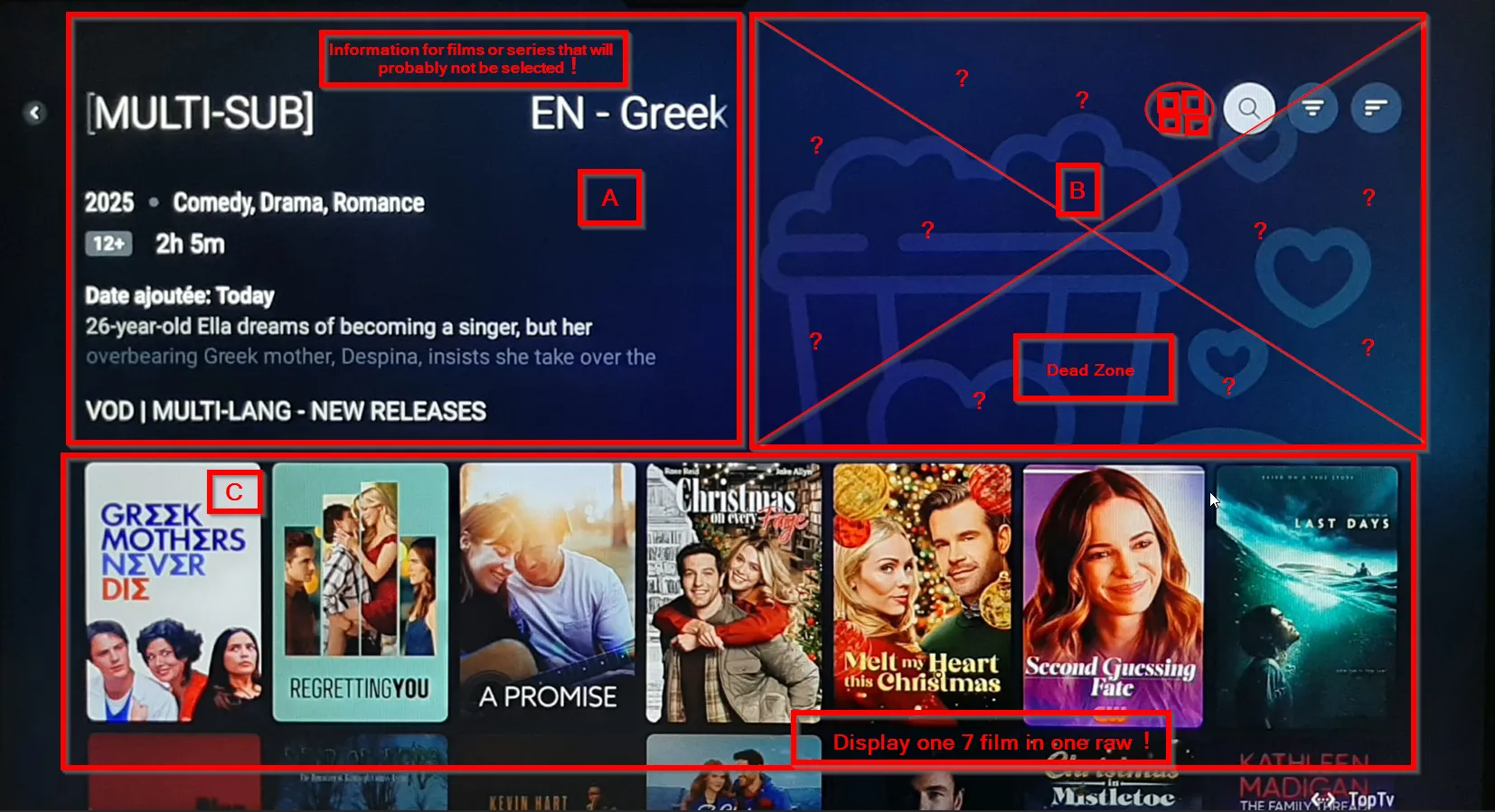
Zone A – Information Panel (1/4 of the screen)
This area displays information about the currently highlighted movie in Zone C.
However, each time I scroll through the list, the device loads new information for films I am not actually selecting.
This constant loading is unnecessary and wastes processing power and memory.
Most users scroll quickly through the list to find the movie they actually want we do not need detailed information for every poster we briefly pass over.
This contributes to slower navigation and a less efficient user experience.
I will come back to this issue again when discussing Zone C.
Zone B – Unused “Dead Zone” (1/4 of the screen)
This zone currently serves almost no purpose. It occupies a large portion of the screen and contains only three buttons that are rarely used. For anyone using a 55” TV or larger (which is very common for Z12 Ultimate customers), this area represents a significant amount of wasted space — more than 2000 cm² on a 55” display — without providing any real value.
These buttons could easily be moved to the top-left area of the screen, next to Zone A, without impacting usability.
Zone C – Main Content Area (2/4 of the screen)
This is the most frustrating part of the interface.
Despite being the zone users interact with 90% of the time, it displays only 7 movies at once, and navigation is strictly horizontal.
This forces the user to scroll through every single movie one by one, making browsing extremely slow and uncomfortable.
This design has pushed several users I know — and many others online — to install third-party streaming apps, or even consider leaving the Formuler ecosystem entirely because of this browsing experience.
Suggested Solution – Grid View Option
To significantly improve the user experience, I strongly recommend implementing a grid view for movies and series.
This would allow users to see many more titles at once and navigate much faster, while reducing the workload on the device.
MyTVOnline previously offered a good catalog experience, and many users stayed with Formuler because of this.
Bringing back a grid-style option would greatly improve usability.
A simple solution would be to add a button in Zone B for exemple (as marked in red in the screenshot) that allows users to permanently switch between the current layout and a grid layout.
If the option is turned off, the interface can revert to the existing display.
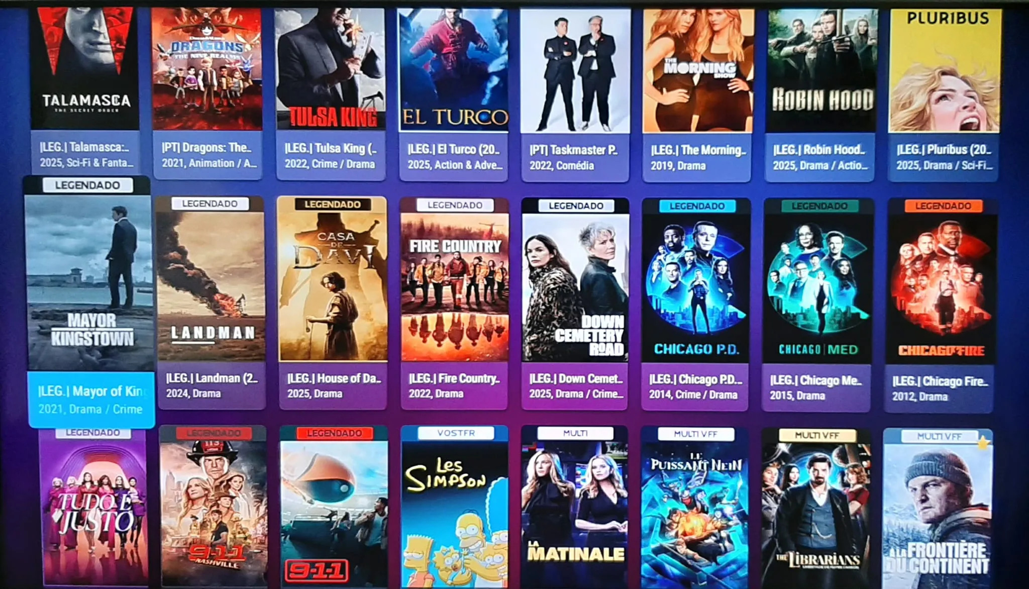
MyTvOnline 2 is more easy and more user friendly to use ![]() :
: